


Visual & Interaction Design
Design System


Low-Fidelity Wireframes
After receiving approval from my stakeholders on the initial paper sketches, I proceeded to create low-fidelity wireframes for all the screens of the website. I digitized these wireframes and validated them with the stakeholders involved in the project. Key wireframes included:
-
Homepage: Highlighting featured services and quick search functionality.
-
Service Listing Page: Clear categorization and filtering options.
-
Service Detail Page: Detailed information, pricing, and availability.
-
Booking Flow: Step-by-step booking process.
Paper Sketches
I concentrated on the core features of the product and created the initial wireframes for Vhelpp using pen and paper. Afterwards, I tested the paper prototype with my stakeholders to validate my design concepts.


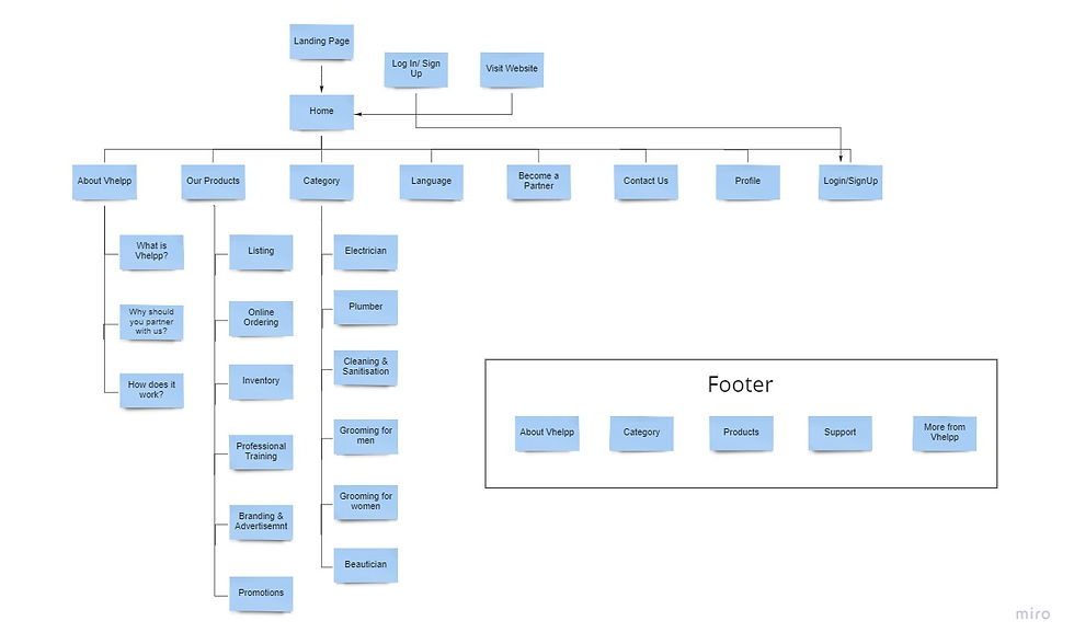
Sitemap V.01
Sitemap V.02

Sketching out the Possibilities
"Design is not just what it looks like and feels like. Design is how it works."
- Steve Jobs
User Persona
Based on the user research I conducted, I created two user personas that capture the essence of my target users. This helped me define their expectations and identify problems in a constructive manner.
Competitor Benchmarking
I selected two potential competitors, Urban Company and Fiverr, to create their marketing profiles, SWOT analyses, and conduct a UX evaluation of their products. The objective was to identify the problems users face with the competitors' offerings and to gain insight into what users might expect from the product I am designing.

Key Insights
2. Service Providers need:
-
A platform that highlights their skills and offerings.
-
Easy management of bookings and payments.
-
Trustworthy communication channels with customers.


MY ROLE
Vhelpp aims to provide a virtual platform for local businesses and professionals, offering a seamless and transparent experience for discovering, booking, delivering, and paying for services. We set out to design a comprehensive website that prioritizes usability and aesthetic appeal across all pages.
I oversaw all aspects of the design work, including UX, visual, and interaction design. Additionally, I created the key pages for the website, which will be implemented by developers to launch the platform.
UX DESIGNER;
UX RESEARCHER;
VISUAL DESIGNER
TEAM
TEAM VHELPP
TIMELINE
SEPT, 21’- NOV, 21’
Project Brief: Vhelpp- A Vision for Local Empowerment
In today's fast-paced digital world, small businesses and independent professionals often struggle to gain visibility and compete with larger corporations. Vhelpp emerged as a platform with a simple yet powerful vision: to provide a seamless, transparent, and empowering experience for home-grown local businesses and professionals. From discovery to booking, from delivery to payment – every step needed to be intuitive, beautiful, and efficient.
As the Lead UX & UI Designer, I was entrusted with designing Vhelpp's complete website experience. My role spanned:
-
UX Research and User Flows;
-
Information Architecture;
-
Wireframing and Prototyping;
-
Visual Design and Interaction Design;
-
Designing key pages for implementation by developers.
This case study walks you through the design process, challenges, and the solutions crafted.


The Problem Space
Challenges Faced by Local Businesses
Through our research and stakeholder interviews, we identified several pain points for local businesses and service professionals:
-
Limited Online Presence: Many businesses lacked a digital presence, making them hard to discover.
-
Complicated Booking Processes: Existing platforms had convoluted booking systems, leading to user frustration.
-
Transparency Issues: Unclear service details, pricing, and delivery timelines reduced trust.
-
Fragmented Experience: Separate tools for discovery, booking, and payment led to a disjointed user experience.
Our Design Goals
To address these challenges, we set out with the following design objectives:
-
Seamless User Journey: Create an end-to-end experience that flows naturally.
-
Transparency and Trust: Ensure clarity in service details, availability, and pricing.
-
Aesthetic Appeal: Design a clean, modern interface that inspires confidence.
-
Empower Local Businesses: Highlight the unique value of home-grown services.
Design Process
During the project, I worked with a collaborative team of stakeholders who consistently helped me understand its business aspects. In the initial phase, our focus was on comprehending the platform, its business implications, and the users of the product.
![Design Process [Recovered]-01 1](https://static.wixstatic.com/media/69b035_9da22f35380c43c1bbf71a7145892571~mv2.png/v1/fill/w_980,h_551,al_c,q_90,usm_0.66_1.00_0.01,enc_avif,quality_auto/69b035_9da22f35380c43c1bbf71a7145892571~mv2.png)
Research and Discovery
“It is the duty of machines and those who design them to understand people."
- Don Norman
Understanding Our Users
We conducted online surveys with two key user groups:
-
Service Seekers: Individuals looking to book local services.
-
Service Providers: Local businesses and professionals offering their services.

Key Insights
-
Service Seekers want:
-
Quick, easy discovery of services.
-
Reliable information and transparent pricing.
-
Smooth, secure booking and payment processes.


Defining the User Journey

End-to-End Flow
Based on the insights, I designed a comprehensive user journey for both the user personas covering:
-
Discovery: Searching and browsing for services.
-
Booking: Selecting dates, services, and confirming appointments.
-
Delivery: Real-time updates and service execution.
-
Payment: Seamless, secure payment processing.

User Flow


After completing the research and analyzing the results, as well as understanding the needs and goals, I moved on to the development stage of the design process. I began by creating a sitemap for the website, which outlined the primary features and the structure of the website's architecture. After I sent the initial sitemap to my client, I received some feedback, which I incorporated into the second and final version of the sitemap. Below are the two versions of the sitemap that I created for the website.
Sitemap V.01
To ensure consistency, I developed a design system that included:
-
Color Palette: Warm, inviting tones that evoke trust.
-
Typography: Clean, modern sans-serif fonts for readability.
-
Illustrations: Aligned to the brand’s minimal and clean design.
-
Components: Buttons, cards, and form elements for reusability.


Service Listing Page
-
Easy-to-browse cards with essential information.
Homepage
-
Intuitive search bar.
-
Featured local businesses.
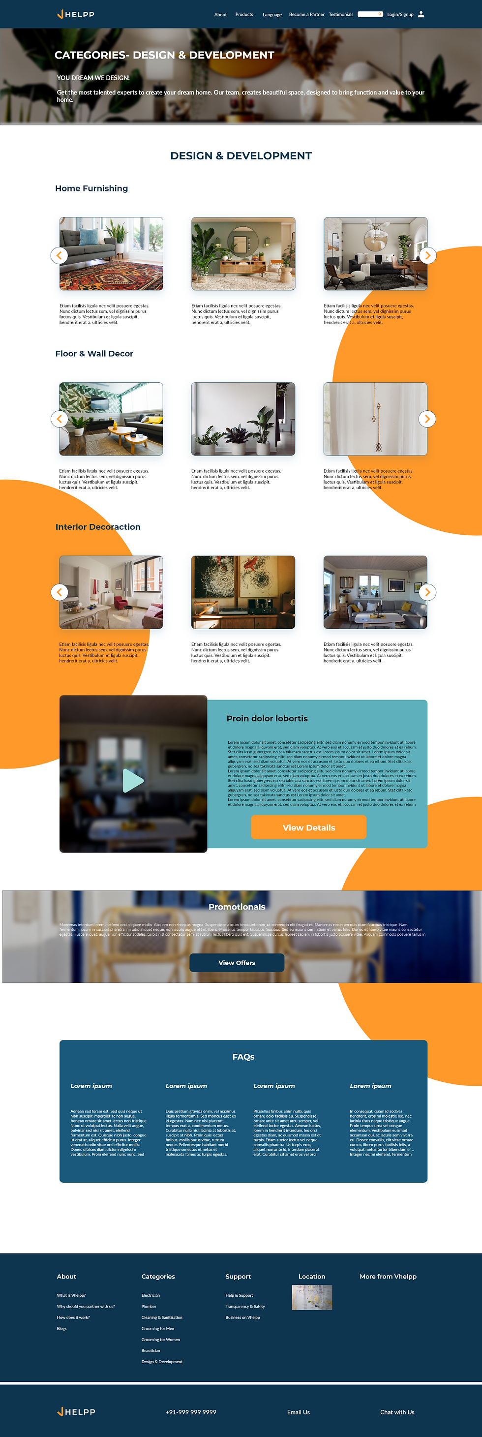
Key Pages Designed
Service Detail Page
-
Comprehensive service descriptions.
-
Clear "Book Now" call-to-action.

Booking & Payment Flow
-
Step-by-step process with progress indicators.


UI Interactions
I have configured the interactions for the screens I designed to facilitate usability testing for users and to demonstrate the website in real-time to stakeholders. I have also sent this information to the development team to ensure that the designs and their interactions remain intact.

To ensure users remain familiar with the interface for global navigation, the main categories of the website are positioned in the top bar. This bar highlights each category, allowing users to easily see which page they are currently visiting.
The 'Vendor List' section categorizes vendors by services offered, allowing users to filter searches and recommend vendors to friends using a "Recommend" toggle button. To encourage sign-ups, testimonials from vendors and clients provide social proof.


Final Outcome
-
The website prototype has undergone user testing with stakeholders.
-
Stakeholders provided positive feedback on the designs.
-
The website is currently being developed by the startup's software developers.
The "Order & Payment" details page has been designed minimally to provide users with a hassle-free transaction and a transparent ordering process.
Reflections: What I Learned
-
User Feedback is Invaluable: Early testing helped us refine the design significantly.
-
Consistency Matters: A strong design system ensured a cohesive experience.
-
Transparency Builds Trust: Clear information makes users feel confident.
This project reinforced the power of user-centered design in creating impactful digital experiences. Like any other design and product, there is still room for improvement for the website as this project evolves, and I would love to work on future enhancements.