Reflections: What I Learned
This project underscored the importance of aligning design with a mission. Designing for GreenAmmo was not just about creating an appealing interface but crafting an experience that empowers users to contribute to a larger cause. The journey taught me how thoughtful UX design can amplify impact, particularly when dealing with socially driven initiatives.
Storyboarding
Storyboarding allowed me to visualize the user experience and their likely interactions with the website.
STORYBOARD:1- EXPERIENCE OF JOINING GREENAMMO FOR FIRST TIME

MY ROLE
GreenAmmo, a grassroots initiative by Amit and Momo, addresses waste management in rural India (Himalayas and coastal regions), focusing on practical plastic and sanitary waste solutions. A centralized website was developed to support their campaigns, resources, and community engagement. This UX case study details the website's development, emphasizing simplicity, accessibility, and engagement. Key features include intuitive navigation, compelling storytelling, and clear calls to action to facilitate learning, involvement, and sustainable change.
UX DESIGNER;
UX RESEARCHER;
VISUAL DESIGNER
TEAM
TEAM GREENAMMO
TIMELINE
MAR, 21’- AUG, 21’
Project Introduction: From Vision to Action
In a world where the urgency of climate change and waste mismanagement grows each day, GreenAmmo was born from a shared passion for sustainability and community impact. Amit and Momo—partners in life and purpose—left their corporate careers to pursue grassroots environmental work. Their vision for GreenAmmo was to empower communities across India with accessible and practical waste management solutions.
Their journey took them through the Himalayas and coastal regions, helping villages implement waste systems that aligned with local lifestyles rather than disrupting them. While GreenAmmo maintained a social media presence on platforms like Facebook, Instagram, and Spotify, the need for a centralized website to unify their campaigns, stories, and initiatives became clear.


The Challenge: Bridging Awareness and Action
GreenAmmo’s primary goals for their website were:
-
To serve as a central repository for their campaigns, projects, and educational resources.
-
To provide clear, actionable ways for users to get involved.
-
To maintain an aesthetic that aligned with their values: natural, minimalistic, and people-centric.
-
To ensure accessibility for a diverse user base, ranging from rural communities to urban environmental advocates.
The challenge was to balance rich content with intuitive navigation, creating a digital space that felt both informative and inspiring without overwhelming the user.
Research & Discovery: Understanding the Stakeholders
I kicked off the project by conducting comprehensive research to better understand GreenAmmo’s stakeholders, challenges, and the broader waste management ecosystem in India. This phase included:
Stakeholder Interviews
I engaged directly with Amit and Momo to grasp their vision, the challenges they faced in the field, and their expectations for the website.
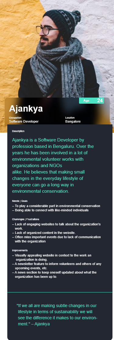
User Personas
I identified three primary user groups:
-
Community Leaders: Individuals in rural areas looking for sustainable solutions for their villages.
-
Urban Advocates: Environmentally-conscious citizens eager to support initiatives.
-
Potential Partners: NGOs, policymakers, and organizations interested in collaborating with GreenAmmo.

Competitive Analysis
To understand how similar organizations use their websites to reach a broader audience and gather design inspiration, I conducted a competitive analysis of prominent websites with similar environmental and sustainability goals. These included the Environmental Working Group, Climate Justice and Energy, One Percent for the Planet, and Earth Guardians. By meticulously analyzing these sites, I identified both effective and less effective design elements.

Empathy Mapping
After extensive discussions with peers and others to understand user perspectives, I created an empathy map to identify their needs, goals, and problems.

UX Strategy: Crafting a User-Centric Experience
Core Design Principles
-
Simplicity & Clarity: Minimalistic design to avoid cognitive overload.
-
Engagement Through Storytelling: Highlighting real-world stories to inspire action.
-
Seamless Navigation: Easy access to key sections like "Campaigns," "Initiatives," and "Get Involved."
-
Accessibility: Ensuring the website is inclusive and easy to use for people with different levels of digital literacy.
Site Mapping
During the research phase, following user interviews and client discussions, a site map was developed. After careful review and approval by the client, this site map guided the initial website content setup.


STORYBOARD:2- OLD VOLUNTEER OF GREENAMMO BROWSE THROUGH UPCOMING EVENTS IN THEIR WEBSITE

User Flow
The website's user flow ensures a seamless and intuitive experience for users as they interact with the site.

Design Process: From Concept to Execution
Paper Sketches
Initial website layout concepts were sketched on paper to brainstorm various options. These concept sketches then informed the creation of wireframes, providing a general layout for key screens before being digitized as low-fidelity wireframes.

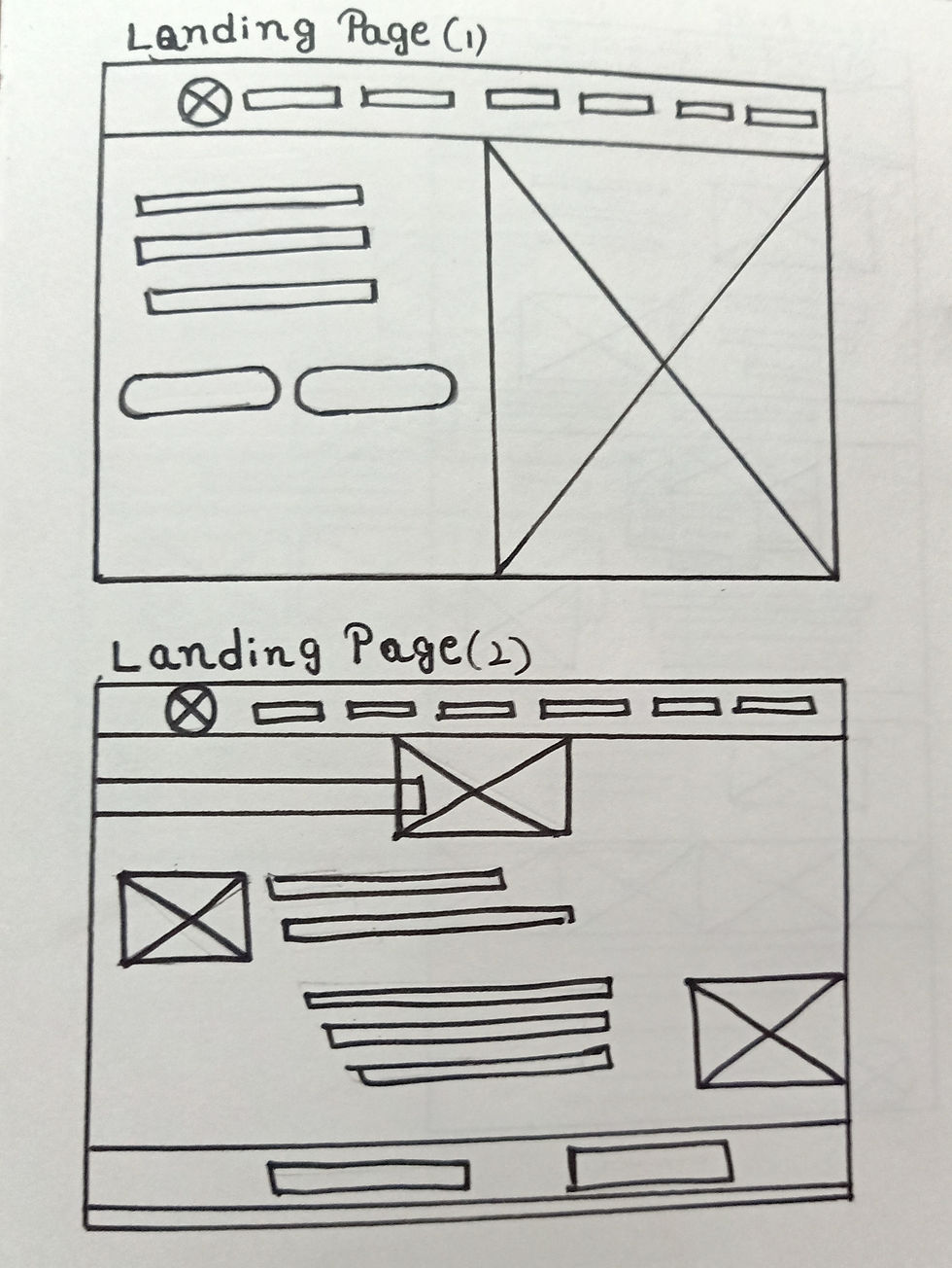


Wireframing
I created low-fidelity wireframes to map out the structure of key pages, ensuring clarity in layout and content hierarchy. The focus was on clean, modular sections that users could easily scan.


Visual Design
The visual design captured GreenAmmo’s essence with:
-
Color Palette: Earthy greens and blues, symbolizing nature and sustainability.
-
Typography: Clean, readable fonts that balanced modernity with simplicity.
-
Imagery: Authentic photos from GreenAmmo’s fieldwork to build trust and connection.

Key Pages
Get Involved Page:
-
Clear paths for volunteering, donating, and partnering.
-
A form for potential collaborators to reach out directly.


Landing Page:
-
Aims to drive user engagement and encourage action.
-
The Trust's core values are prominently displayed as header text to reinforce its mission and connect with visitors.

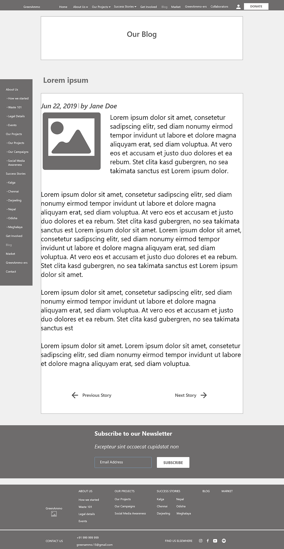
Blog Page:
-
GreenAmmo Trust has a substantial amount of blog content.
-
To improve content discoverability, the blog page was designed with two sections: "Newer Blogs" and "Older Blogs."
-
This categorization provides a clearer user experience.


Contact Page:
-
The Contact page offers a simple and user-friendly way for visitors to connect with the Trust.
-
Designed for ease of use, the Contact page facilitates communication between the Trust and its users.


Interaction Design: Guiding Users Seamlessly
-
Micro-Interactions: Subtle animations for buttons and navigation elements to provide feedback and enhance engagement.
-
Calls-to-Action (CTAs): Strategically placed CTAs guiding users to donate, volunteer, or learn more.
-
Responsive Design: Ensuring the website functioned smoothly on both desktop and mobile devices.


Outcome: A Platform for Change
The final design of GreenAmmo’s website achieved its goals:
-
Unified Presence: A single hub for all initiatives, campaigns, and resources.
-
User Engagement: Intuitive design encouraging users to explore and take action.
-
Scalability: A flexible design that can grow as GreenAmmo expands its initiatives.
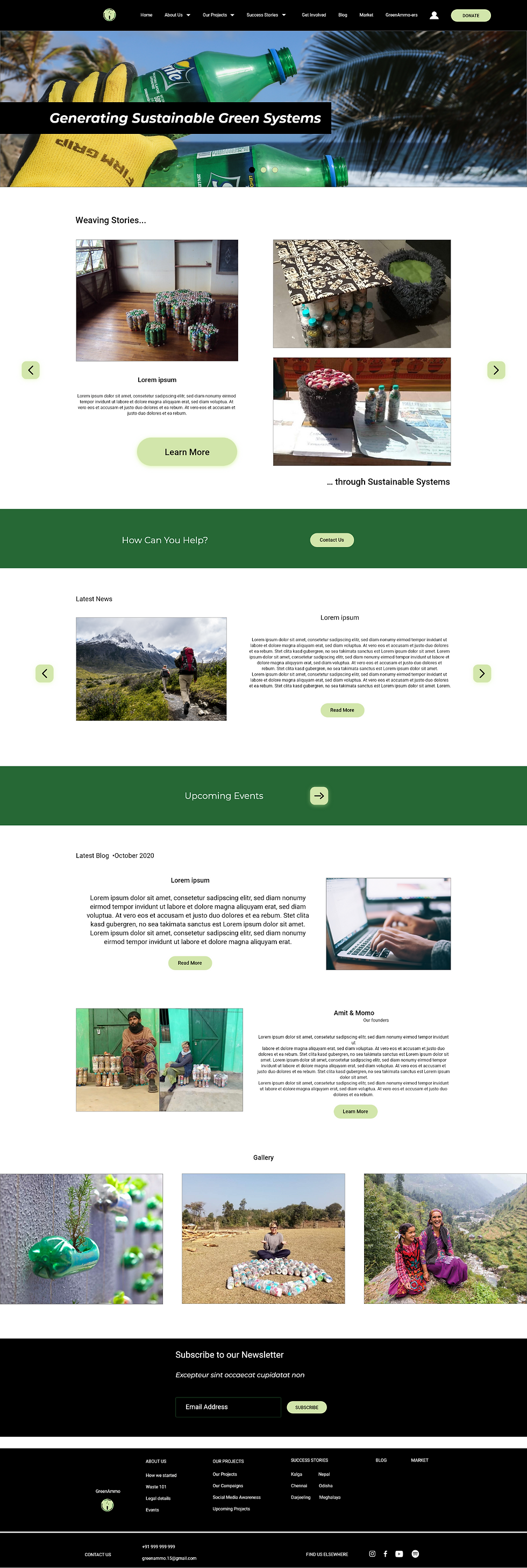
Home Page:
-
A hero section with a compelling call-to-action.
-
Quick links to ongoing projects.
-
Testimonials from communities impacted by GreenAmmo’s work.


Initiatives Page:
-
Detailed descriptions of Plastic Waste and Sanitary Waste management projects.
-
Visual data representations to simplify complex information.